Earlier this week, I posted an interview with Rian Hughes, who conceived and designed the trade dress and logos for the DC Comics’ Tangent books in 1997. The also designed the logos for the 1998 wave and the more recent Superman’s Reign, with in-house designers echoing his styles for the trade dress on those books.
Rian was kind enough to share some long-unseen preliminary cover-design work as well as unused logo concepts for the books. Many, many thanks to Rian for sending and allowing me to post them.
First up are some cover-design roughs, which Rian talked more about in the interview:
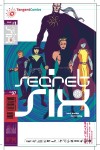
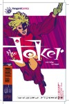
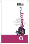
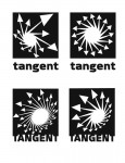
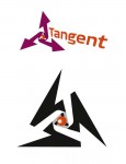
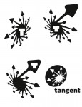
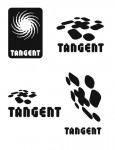
When a designer is commissioned to create a logo, especially one that will be used to represent an entire product line, clients often want to see several concepts. And from a creative standpoint, it’s simply good process to design several concepts in order to work out the bugs in your own ideas. Here’s a look at several of Rian’s conceptsfor the Tangent line’s logo that ultimately were not used.
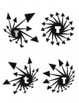
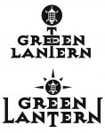
And finally, here is a look at some concepts and variations of logos from the first wave of books in 1997.


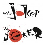


And the 1998 wave:


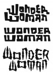


Thanks again to Rian for these great behind-the-scenes looks at the creative process. Rian’s hard work really helped establish not only a distinctive look for the books, but help embellish the overall concept, furthering the idea that the Tangent books were something special.
Don’t forget to visit his site, Device for more of Rian’s design and illustration portfolio.
